
Strong design is built on both contrast and balance. Contrast creates visual interest by emphasizing differences in color, shape, scale, and texture, while balance ensures those differences work together to create a cohesive composition.
The Toy Story franchise is an excellent example of these principles in action. Although each character has a distinct visual identity, they are designed to complement one another within a consistent artistic style. The following examples explore how thoughtful use of contrast creates memorable characters while balance unifies them into a believable and engaging world.

Contrast Examples
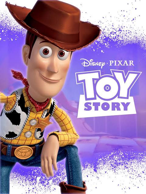
Typography Contrast
This Toy Story promotional poster showcases three distinct brand identities, each represented by its own recognizable typography. The Disney logo uses its iconic flowing cursive script, while the Pixar logo features a clean, straight, and geometric typeface. The Toy Story title has its own unique and established design, with "TOY" positioned above the bold, boxed "STORY." This title treatment has remained consistent throughout the franchise and serves as a recognizable brand identity independent of both Disney and Pixar.
Google. (Retrieved July 23, 2026). [Untitled image] [Photograph]. Google Images. https://encrypted-tbn3.gstatic.com/images?q=tbn:ANd9GcRw1ynxwA6p8jGMs5TD1Q6BFgn9fafEk-XQ3lrYQGQo0q4Ggo3a
Color Contrast
This image does a great job showing the contrast between the two main characters, Woody and Buzz Lightyear. Woody’s colors are warm and earthy, fitting his cowboy background and classic western style. Buzz, on the other hand, has a brighter, more modern look with colors that feel futuristic and space-inspired. The difference in their color palettes helps reinforce who they are and makes each character instantly recognizable.
u/Zealousideal_Cat440. (Retrieved July 23, 2026). Buzz and Woody's signature colours –
White and Brown, Purple and Yellow or Green and Blue? [Photograph]. Reddit. https://www.reddit.com/r/toystory/comments/1qvngz2/buzz_and_woodys_signature_colours_white_and_brown/

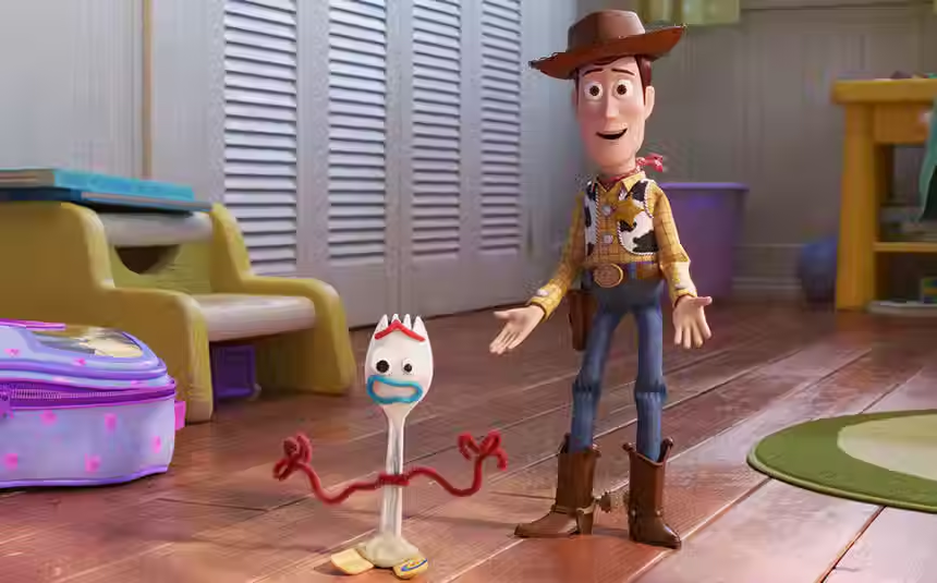
Emotional Contrast
This image is a great example of the emotional contrast between the characters in this scene. Forky is still new to the world and finds many unfamiliar experiences overwhelming and frightening. Woody, on the other hand, is an experienced toy who has seen situations like this countless times and often takes on the role of protector and guide for others. While Woody remains calm and confident, Forky reacts with fear and uncertainty, highlighting the difference in their perspectives and experiences.
SYFY Wire. (Retrieved July 23, 2026). Inside Toy Story 4 and its great forkin' existential crisis [Photograph]. SYFY. https://www.syfy.com/syfy-wire/toy-story-4-forky-existential-crisis
Balance Examples

Symmetrical Birthday Invitation

Asymmetrical
Birthday Invitation Design

Radial Symmetry
Birthday Invitation Design
