top of page
Ad Redo
Keep her where she belongs...
This 1970's ad campaign from Weyenberg Massagic Shoe Company is a suprising reminder of what society was like only 50 years ago. This manufacturer still successfully operates today as Weyco Group Inc.
CNN. (Retrieved July 23, 2026).
This ad for Weyenberg Massagic shoes was featured in Playboy magazine and reprinted in the "No Comment" section of Ms. magazine in December 1974 [Photograph]. CNN. https://www.cnn.com/2015/07/22/living/gallery/seventies-sexist-ads

Mind Map


During my Mindmap conception exercise I found that Weyco Group Inc. sells footwear under the brands Nunn Bush, Florsheim, and Stacy Adams which are strictly men's brands. Women's footwear is sold under their brands BOGS and Rafters and are estimated to generate only 20-25% of overall sales.
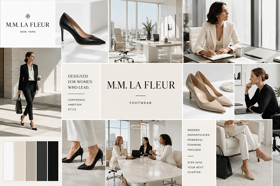
I decided to support another brand that focuses on professional women and looked into the top 5 brands that target this demographic. During my research i found that M.M. LaFleur presented the most desirable pump, rightfully named the "Sara Flint Perfect Pump". Just the right shoe for any executive professional who is on the go and still wants to rock a heel.
I was sure that I wanted to replicate the same text at the top with the slogan "Keep her where she belongs...". I also decided that I wanted the model to resemble the original model with the strawberry blonde/reddish hair styled in the same 1970's hairstyle with her nails done the same and wearing the similar smirk she carries in the orginal ad.
I mapped 8 different image concepts to create my thumbnails:
-
Executive seated confidently in her office.
-
Executive standing at her desk.
-
Leading a boardroom meeting.
-
Flying first class for business.
-
Breaking through the glass ceiling.
-
Climbing the steps to success.
-
Executive overlooking the city skyline.
-
Stepping confidently forward in heels.
Thumbnails
Before creating my final ad, I explored several different ideas through hand-drawn thumbnails. These quick sketches allowed me to experiment with layout, focal points, imagery, and the placement of design elements before choosing the strongest direction for my final design.
Thumbnail Art Ad Redo 1

Thumbnail Art Ad Redo 2

Thumbnail Art Ad Redo 3

Thumbnail Art Ad Redo 4

Thumbnail Art Ad Redo 5

Thumbnail Art Ad Redo 6

Thumbnail Art Ad Redo 7

Thumbnail Art Ad Redo 8

Final Ad

Behind the Design
Planning
Who is the target market?
My target market is professional women who are building careers, leading companies, and working toward the next level. I wanted to speak to ambitious women who want to look professional and powerful without losing their femininity.
What sort of colors appeal to this audience?
I chose blush, mauve, gold, black, and warm neutral colors. I wanted it to feel feminine, but not overly feminine. I also wanted it to feel sophisticated, expensive, and powerful.
What is the emotion you would like to use to sell this product or service?
I wanted women to feel powerful when they saw this ad. “Keep Her Where She Belongs” catches your attention because at first it sounds like I am saying a woman should know her place. Then you see the image and realize that is exactly the point—her place is wherever she decides it is.
How can you use color, line, and layout to express this emotion?
I used the woman moving forward, the city ahead of her, and the heel breaking through the glass to show strength and movement. The softer colors keep it feminine and polished, while the shattered glass gives it that feeling of breaking through something that was standing in her way.
Design
Specifically, why did you use the colors you chose?
I wanted the colors to feel feminine and powerful at the same time. The blush and mauve bring in the femininity, the gold feels successful and elevated, and the darker colors give the design contrast and keep it professional.
What is the focal point of the design?
The heel breaking through the glass is definitely the focal point. It represents breaking the glass ceiling, and once I developed that idea, it really became the entire concept behind my final ad.
Specifically, how did you integrate design elements?
I played with scale, contrast, movement, and placement. The oversized heel immediately gets your attention, the shattered glass adds movement, and then the woman walking toward the city carries your eye into the rest of the ad.
Why did you choose the pictures you used?
I wanted the image to tell the story before someone even read the words. The woman is moving forward, the city represents where she is going, and the heel breaking through the glass represents what she is willing to break through to get there. For me, all of it comes back to the same message: her place is wherever she decides it is.
bottom of page